Using Paths and Layers in GIMPI'm gonna draw Wario and show you want I do at every step.
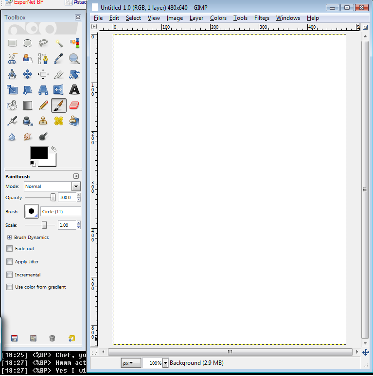
Okay so, here we've got a fresh clean image of nothingness. It's one layer. This is going to be my sketch layer, called "Background" by default. The default background layer already has no alpha channel (which is used for transparency). this is good though, because when you erase you'll want to make it white (the secondary color) and not transparent. Save often. In the event GIMP crashes, saving a lot can protect your rage meter from overflowing. First save it as an XCF anywhere (I keep a folder called xcf for unfinished things, with a folder in it for the completed things in xcf/finished for reference and just in case you want to change something). XCFs keep the layers separate.
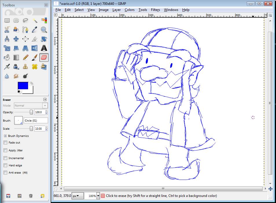
This isn't a how to draw tutorial, so I'm not going far into that. I sketch everything in blue. It's easier to see what you've traced in black later if it isn't black--red is even better. But, if you don't have a graphics tablet and instead scan a drawing on paper, that's fine for a sketch as well.
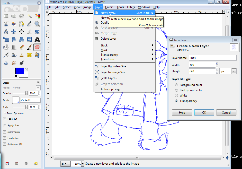
When you've got your sketch make a new layer with an alpha channel (transparency). This is for lines. When you have multiple layers, you can navigate them with the PGUP and PGDN keys. Also, Home will take you to the top layer, and End will take you to the bottom one.
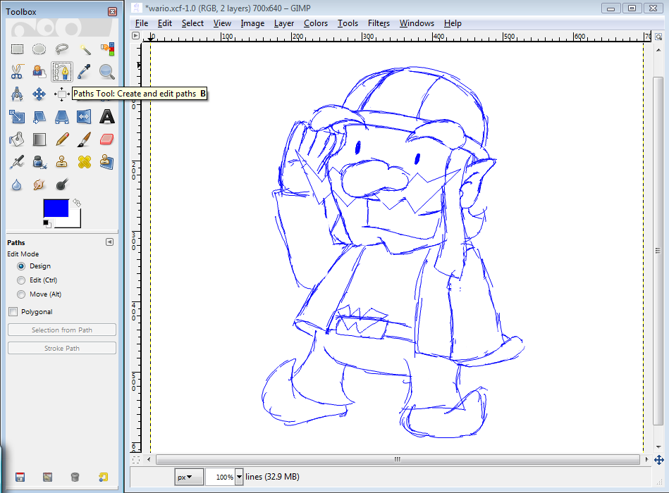
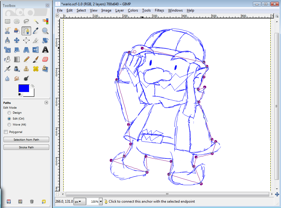
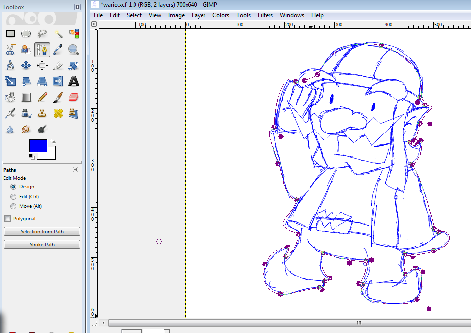
If the bendy lines in MS Paint are tricycles, paths are F-ZERO racers. To start, put your dots everywhere they'll form an angle. For very long curving lines, you'll get a feel for where to add more as you gain experience. Note: Don't touch any other tools until you're done with this set of paths. They'll disappear. You can zoom using the little box next to the name of the layer (100%, 400%, etc) without using the magnifying glass tool, but be very careful about keyboard shortcuts. CTRL+Z will still undo your last action with paths, but Z alone will give you the magnifying glass and get rid of your paths.
If you ever need another point to make the line more flexible, hold CTRL and click where you want it. When you want to "close" a series of these lines into a loop, hold CTRL and click the first dot when creating the final line. You'll know you're doing it right when the cursor shows two dots merging--it looks like an infinity symbol. If you are going to close it as one shape, where you start and finish won't matter.
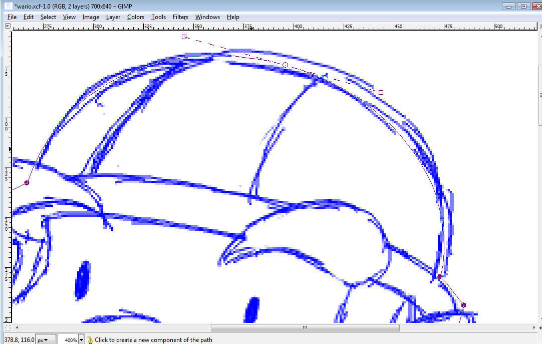
I added a dot to the peak of his helmet.
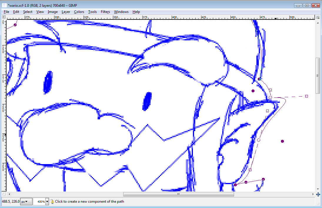
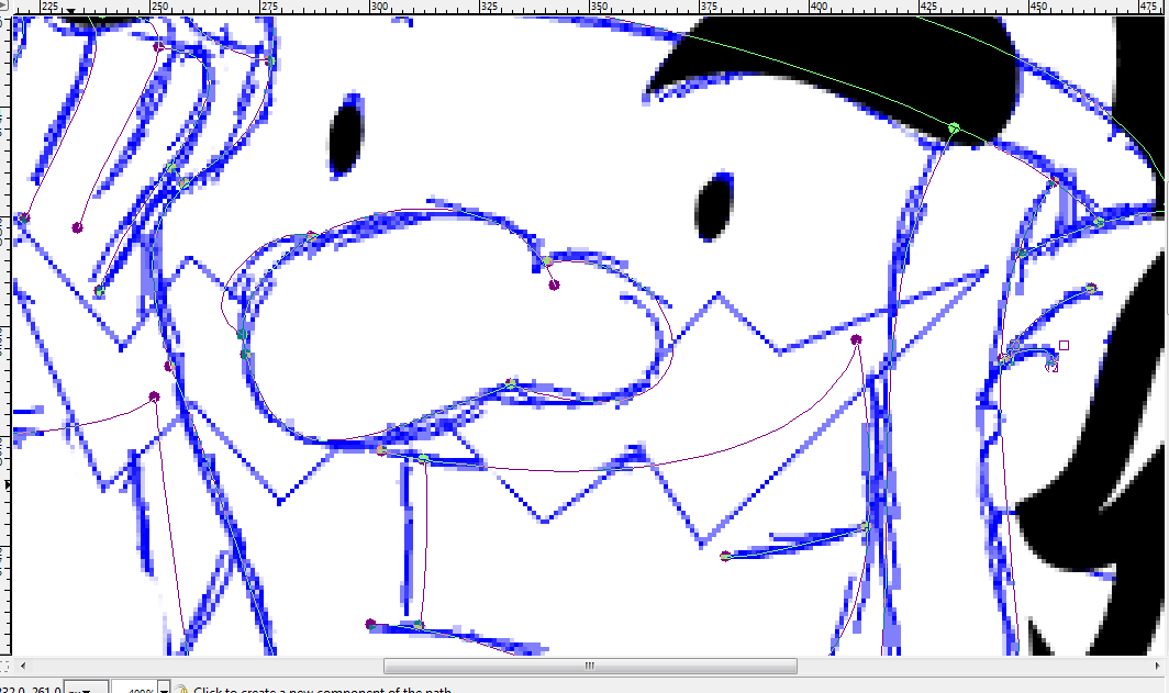
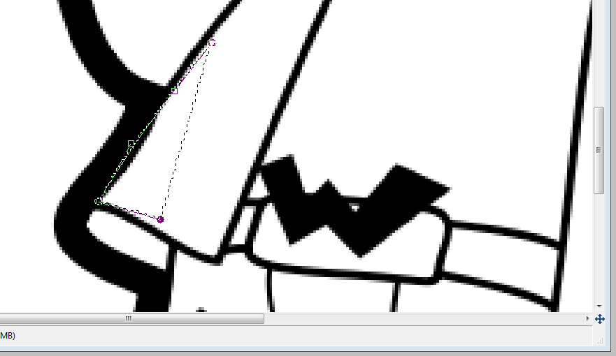
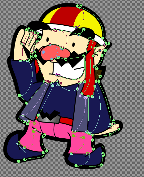
This one shows the sorts of curves you can make with minimal lines. When two dots are "hollow" like that, you can drag them around together without messing with the lines (use shift and click other dots to add more). To "fill in" all the dots so you can grab and move just one, I'll click elsewhere to add another dot outside of the shape. Dots that don't create lines won't do anything at the end. Note: I'm doing the outside only because the outermost will be its own line, thicker than the rest. You'll get a good idea of how to make all the lines equally thick whil I'm tracing the inner lines. Also, I am deliberately ignoring the eyebrow and, had it been on the outside, would have ignored the moustache because those will be black with no "outline," you'll see. Also, I'm not directly tracing the ine again because this one will be thick. I only want it to go over the sketched lines a little. Now, each point has these two dotted lines capped with a square that dictate how they will bend. Obviously, you can move these around--it's more precise than grabbing the line and moving that, but different situations can call for either. If you hold Shift while pulling on one of these squares, the dot's other square will move in the same (but opposite) way--perfect for curves. An example, on Wario's ear. While it may look like I don't need to touch that little line for his finger, look closer. The squares are a little helter-skelter and can make the line I have it draw become a little weird. So it's best to take care of the smallest ones too:
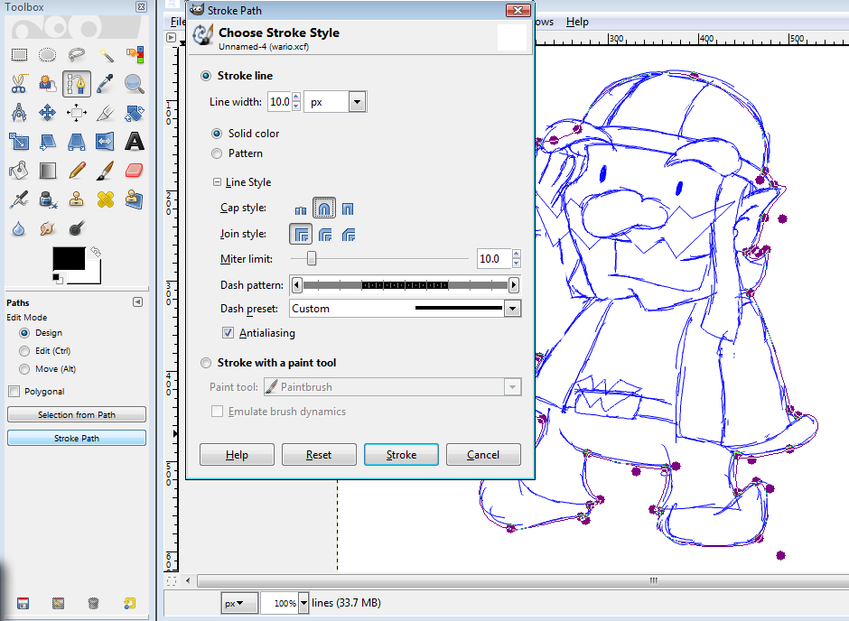
I've covered the whole outside. The toolbox on the left has the commands for paths: selection from path and stroke path. You'll be drawing your line with Stroke.
This is a thick one so I'm going with a 12 (the image says 10 but then I decided on a 12). You can set specific settings to change the way the end of the line is (this is a closed shape though, so it's not important), how angles shape, or even have it use another tool like an eraser, an airbrush or whatever. If you want to use one of those, though, you MUST set the specifics (brush size, opacity, etc) beforehand. As I said, going back to mess with the tool's settings will make your path disappear. If you absolutely have to change a tool's settings, all is not lost. You can go to Windows > Dockable dialogs > paths, and click the paintbrush to bring up the box from before. This is also useful if you accidentally put your lines on the wrong layer.
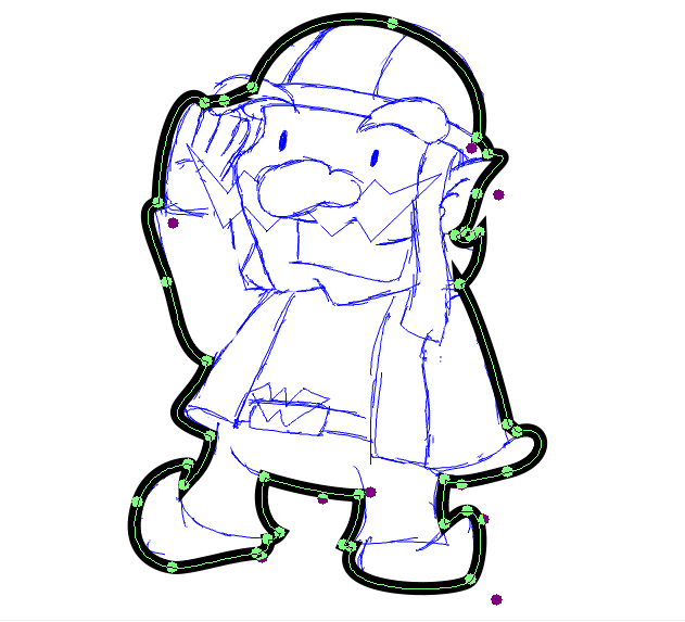
Fabulous. This is a big drawing, so I used an outline 12 pixels thick. The paths don't disappear yet, though, see--you can undo the stroke, mess with the paths and stroke again if you need to change something. You can also select from here and color the whole thing in solid if you want, but with half the line's thickness. That's how I do speech bubbles. Since I'm happy with my fat outline, I'll add some non-line stuff. Closed shapes for the eyes and brows. When you want an oval, you can make one line with a path and immediately return to the first dot and close it. Holding shift while messing with those can get you a perfectly smooth oval, circle, egg shape or whatever. sorry but I forgot to save the screenshot for this step. This time you want to select from path. No settings for that. It'll just do it. Color the whole thing in with a single stroke--if you go over the edge repeatedly, it'll lose its smoothness and turn all pixelly.
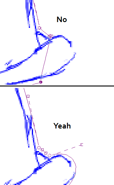
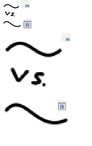
Making inner lines. The thickness I'll use for these is three pixels. I'll usually use lines two pixels thick on people and things in comics. But this is huge. I'm ignoring the moustache because I'm going to select that with more paths and color it in like the eyes and brows. This is where the line cap style you saw earlier comes into play:
Big difference. Do you want a stump or thumb?
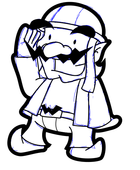
Line art is done. At this point it's normal to go to the sketch layer and hit the delete key to get rid of the sketch, but some things are different. Sometimes there's something you want to have a different color from its background, but you don't want to put a line--Yoshi's belly, a Furret's stripes, whatever. For this, it's the red stripe on Wario's helmet. So I'm going to make a new layer titled "upcolor." When you make a new layer, it is always above the layer you're on. You can move a layer up or down by going to Layer > Stack > Raise Layer/Lower Layer. but it's faster to just go to the layer you'll want to have directly under the new one.
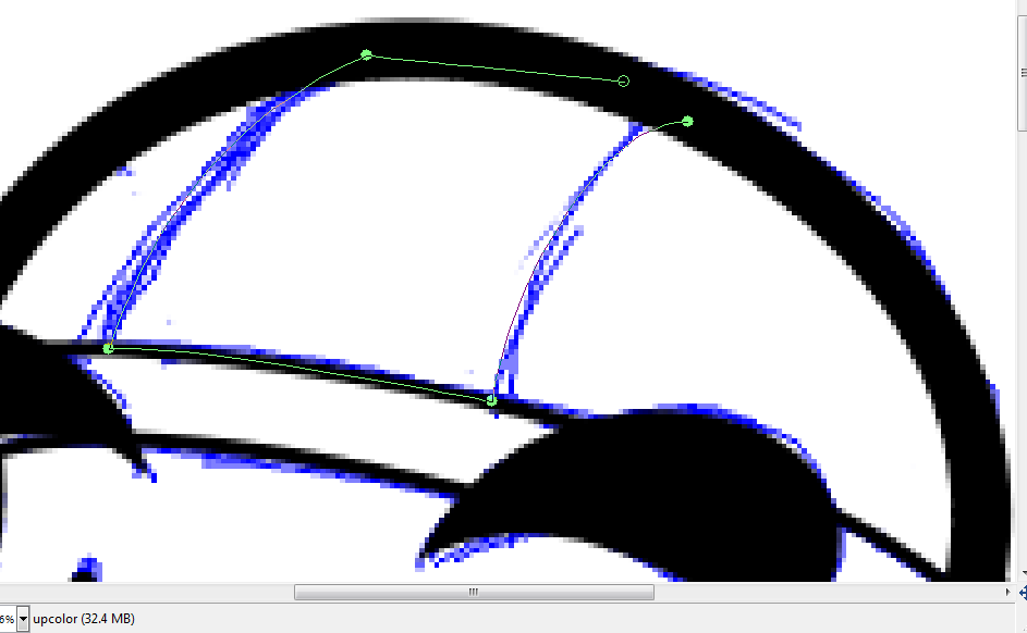
I've made the path that will become the selection for the red stipe. I'm extremely particular about the colors I use--If I have drawn and colored a person or thing before I will open the last thing they were in and use the color picker to take the same colors and use them again. I should just make a big sheet of every SMAAAASH!! regular's colors to speed it up...
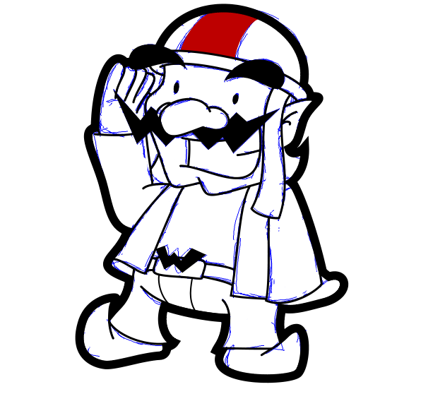
That's what layers are good for. Think of it like this: every layer is a sheet of plastic and you're drawing on each one individually. The bottom layer is white paper, but there are ways to add transparency. The sheet "lines" is just for the black lines and the sheet "upcolor" is just for the red stripe. You can mess with any given sheet without disturbing the others.
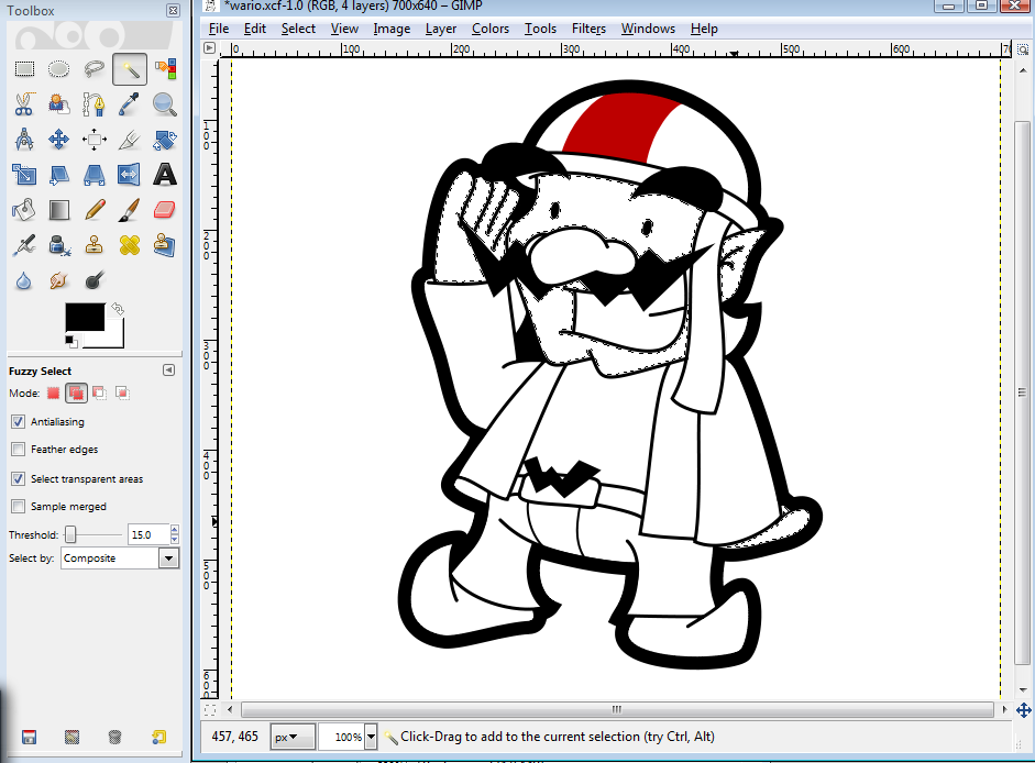
Begone, blue sketch! I keep the white layer until the end because it's easier to see what I'm doing. If you notice something you don't like, now is a good time to fix it. Select with a path, delete. Color time. Make your color layer between the white layer and upcolor. There are two ways you can do this. The first is sloppy, slow, and usually leaves you with unfilled specks of transparency. To do that, just grab your brush and color traditionally. The fast, clean way is like this: 1. Go up to your lines layer and use the magic wand tool to select every part you're going to fill in with the first color you want to use (make it so you add selections with the "overlapping pink boxes" mode:
2. go to Select > Grow and grow your selection by some pixels--just 1 will do it, but if you're using thicker lines, 2 is safe. 3. Go down to your color layer and fill those suckers with the paint bucket! Gradients will also fill in the whole selection.
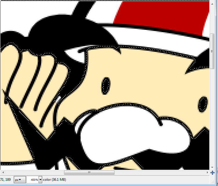
4. Very tight spaces won't get reached by the magic wand (see Wario's thumb?), but that's no problem. Deselect (click outside the selection when the tool is in "single pink square mode") and color the missed part in with the brush. Be sure you get all the corners and things. With a white background it's hard to see them, but a black background can make them look like part of the line. Ultimately I'm going to remove the background, so the parts I miss will become windows to the background on the page this is viewed on, so that's bad. Fill the background with a weird color like magenta or lime green to help you find these gaps if you feel more comfortable that way.
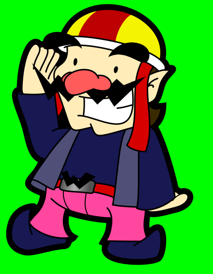
I have terminated all the green visible within Wario's outlines. Or at least enough that even putting him over a lime green background wouldn't make him look strange. If you have a good eye you can see a spot of green on his pants. I caught it and fixed it. Now it's time for shadows. You can put the layer for shading between lines and upcolor. I always name this layer "shadin" for some reason. You especially want your shadows under the lines if you use colored lines.
Now, I use a very specific kind of shadow--I use paths to select the part I want shaded and fill that in with 40% opaque blackness. You're on your own for different kinds of shading, which I highly recommend you pursue. I have some suggestions:
Crop, save, save as PNG:
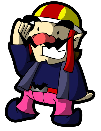
Done! I salute you too, Wario. |
